The Anatomy of a High-Converting Landing Page
Your landing page isn’t just another web page; it’s the frontline of your business growth. According to HubSpot, the average landing page conversion rate across all industries is 5.89%.
That might sound decent at first, but if you’re promoting a high-ticket offer through costly ad campaigns or running a small business with a very limited budget, you’ll quickly see the pain point: 94% of visitors slip away. Think about the wasted ad spend and the opportunities left on the table, you’ll see why you need to optimize your landing pages.
This post breaks down the exact structural elements that separate high-converting landing pages from the average underperforming ones. Here’s what you’ll discover:
- Complete structural framework: The 8 essential elements every high-converting landing page must have
- Proven placement principles: Where each element should appear for maximum psychological impact
- Evidence-backed insights: Research and data supporting each structural decision
- Actionable implementation guide: Specific steps you can take to optimize your own pages
Whether you’re a business owner, marketer, or entrepreneur, you’ll walk away with a clear blueprint for structuring pages that actually convert visitors into customers.
The Foundation: Understanding Landing Page Fundamentals
Before we dive into the structural breakdown, let’s establish what we’re working with.
Landing Page Definition: A landing page is a single-purpose web page designed with one clear goal: to convert visitors into leads or customers. Unlike homepages, which spread attention across multiple links, landing pages strip away distractions and guide visitors toward a specific action.
This could be downloading an ebook, signing up for a trial, purchasing a product, or booking a consultation, etc It must end with an action from the visitor.
Though it may sound easy to understand, a lot of details go into creating a high-converting landing page, but not so much you can’t optimize for them. And, most businesses get this wrong. Common mistakes include:
- Cluttered layouts with too many competing CTAs.
- Weak or vague headlines that don’t communicate value.
- Lack of trust signals like testimonials, reviews, or guarantees.
The stakes are high. Poorly structured landing pages waste your ad spend, dilute your customers’ trust, and squeeze your profit margin. MarketingSherpa found that unclear messaging is one of the top reasons campaigns fail.
That’s why this case study matters.
The stakes couldn’t be higher. With the average cost per click in Google Ads at $2.69 for search campaigns, every visitor who bounces from your landing page represents wasted ad spend and lost opportunity.
If you are a business driving 1,000 monthly visitors to your landing page and converting 2% of that, improving to just 7% conversion could more than triple your leads & conversions without spending an additional dollar on traffic.
The Anatomy of a High-Converting Landing Page
We analyzed multiple categories of landing pages to see which structural elements consistently drive conversions across five key categories, cross-referencing them with published case studies and A/B testing results.
They were structural elements that consistently appeared across every high-performing page, regardless of industry or product type.
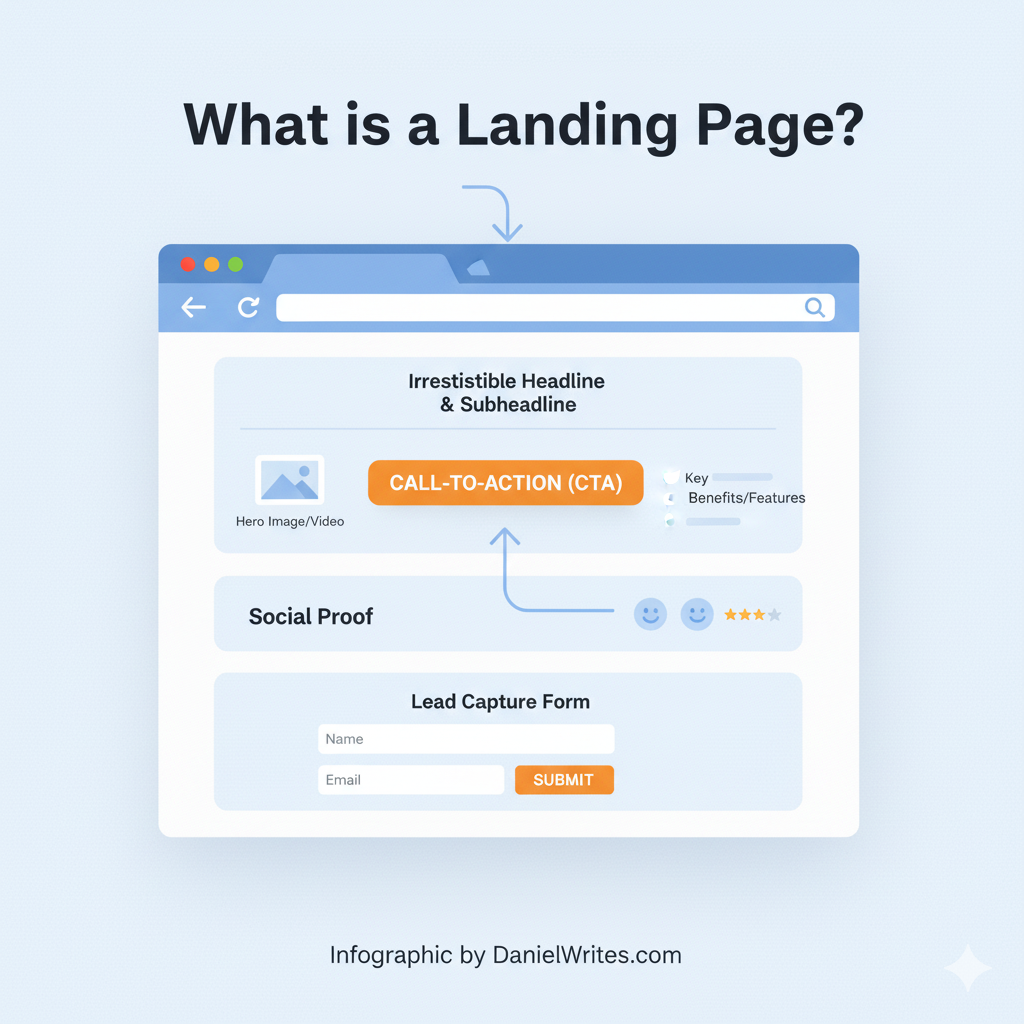
The 8-Element Structure That Drives Conversions
Every high-converting landing page follows the same fundamental structure, regardless of industry or offer. These eight elements appear in a specific order that aligns with visitor psychology and decision-making patterns.
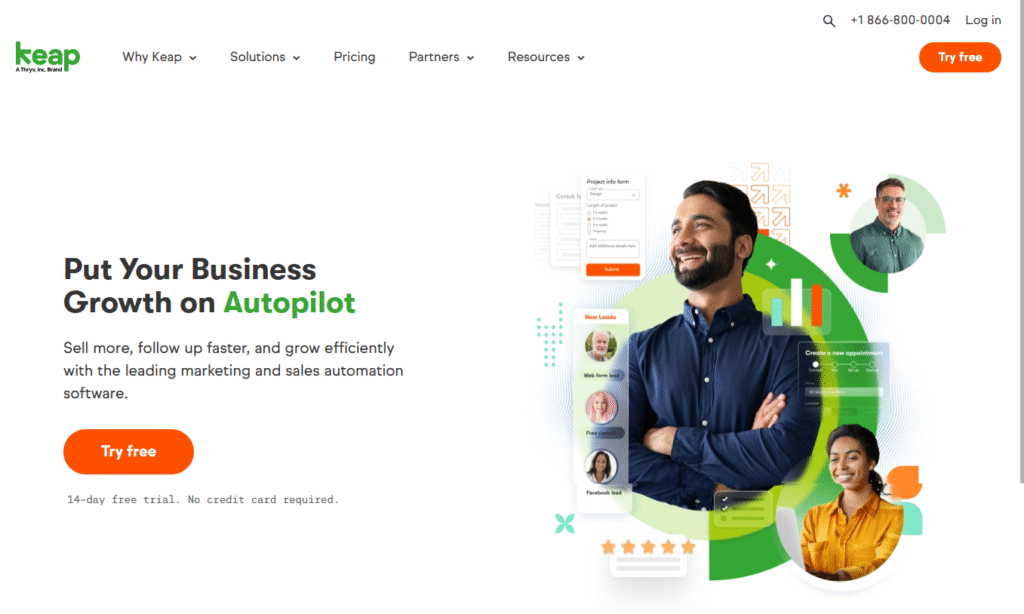
1. Benefit-Driven Headline (Above the Fold)
The headline is your first and most critical conversion opportunity. High-converting pages lead with headlines that focus on outcomes, not product specifications:
- Focus on transformation: “Generate 10x More Qualified Leads” beats “Advanced Marketing Software”
- Use outcome-driven language: Tell visitors what they’ll achieve, not what you offer
- Test for clarity: CXL’s headline testing research shows benefit-driven headlines can improve conversion rates by up to 30%
- Pass the 5-second test: Visitors should understand your value proposition instantly
The most effective headlines follow the formula: Desired Outcome + Time Frame + Specificity. Examples include “Double Your Website Traffic in 90 Days” or “Master Facebook Ads Without Wasting $1000s.”
2. Supporting Subheadline (Value Proposition Reinforcement)
This is positioned directly below the main headline; the subheadline provides supporting evidence and addresses potential skepticism. I have used this method in my home landing page too:
- Reinforce the main promise: Add credibility with specific details or methods
- Address the “how” question: Briefly explain your unique approach or system
- Keep it scannable: 1-2 short sentences that support without competing with the headline
- Build believability: Ground big promises with realistic context
For example, if your headline promises to “Generate 10x More Qualified Leads,” your subheadline might read: “Using our proven 4-step system that’s helped 2,000+ businesses transform their marketing results.”
3. Hero Visual Element (Product Demonstration)
The hero visual should support your headline promise and help visitors visualize success:
- Show the solution in action: Product screenshots, demo videos, or process illustrations
- Support the headline: Visual should reinforce the promised outcome
- Maintain professional quality: Poor visuals undermine credibility instantly
- Consider video strategically: Demo videos can increase conversions by 80% when used correctly
Avoid generic stock photos or images that don’t directly relate to your offer. The visual should help visitors picture themselves achieving the promised results.
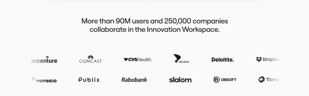
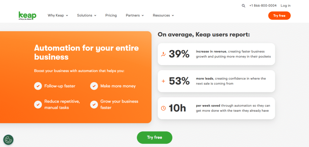
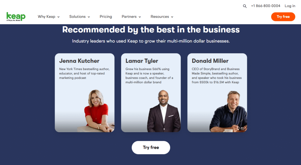
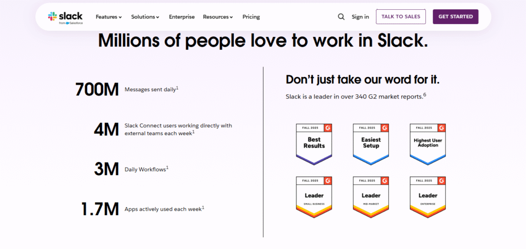
4. Strategic Trust Signals (Credibility Builders)
Trust signals usually appear early on high-converting pages to address skepticism before it becomes resistance:
- Customer logos: 6-8 recognizable company names or logos with “Trusted by X+ companies”
- Security badges: SSL certificates, privacy compliance, or industry certifications
- Achievement indicators: Awards, media mentions, or notable statistics
- Social proof numbers: “Join 50,000+ successful businesses” or similar metrics
Research shows that trust signals can increase conversions by up to 42% when placed strategically near decision points.
5. Benefit-Focused Features Section (The “What’s In It For Me” Zone)
Instead of listing what your product does, high-converting pages focus on what users will achieve:
- Apply the “So What?” test: Turn features into user benefits and outcomes
- Use the transformation formula: “From [current pain] to [desired result]”
- Include specific outcomes: Quantify benefits whenever possible
- Prioritize by importance: Lead with the most compelling benefits for your audience
For example, instead of “Advanced Analytics Dashboard,” use “See exactly which marketing campaigns generate the most revenue (and which ones waste your budget).”
6. Social Proof Integration (Testimonials and Case Studies)
High-converting pages strategically place social proof to reinforce benefits and address objections:
- Use specific, results-focused testimonials: Include actual numbers and outcomes achieved
- Add credibility elements: Photos, full names, companies, and titles when possible
- Match your audience: Choose testimonials from similar businesses or situations
- Address common objections: Use testimonials that speak to typical hesitations
CXL’s research on testimonials shows that specific, results-oriented social proof can improve conversion rates by 34%.
7. Primary Call-to-Action (The Conversion Driver)
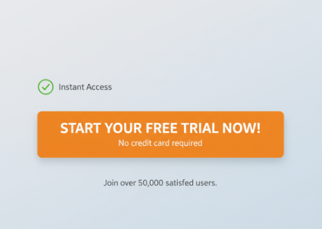
The CTA is where conversion happens, and high-performing pages optimize every element:
- Use action-oriented language: “Get Started,” “Download Now,” or “Book Your Session”
- Create visual prominence: Contrasting colors and sufficient white space
- Repeat strategically: 2-3 instances throughout the page without overwhelming
- Remove friction: Address concerns like “No spam,” “Cancel anytime,” or “Free trial”
The button copy should reflect the visitor’s mental state and the next logical step. Avoid generic words like “Submit” or “Click Here.”
8. Risk Reversal and Final Trust Elements (Objection Handling)
This section shows any additional trust signals for potential customers who hesitate to take action for reassurance:
- Industry badges: These include awards or top-rated achievements in any area of specification
- Money-back guarantees: Reduce financial risk with clear refund policies
- Privacy assurances: Address data security concerns explicitly
- Contact information: Provide multiple ways to reach you for support
- FAQ anticipation: Address common concerns or objections
This section acts as your final chance to overcome resistance and secure the conversion.
The Psychology Behind the Structure
When people land on your page, they don’t move through it randomly; they follow a predictable psychological path. This eight-element framework reflects the natural sequence of how visitors scan, judge, and decide whether to take action.
This framework aligns with that natural decision-making journey:
- Benefit-Driven Headline (Above the Fold) – Instantly signals relevance by addressing the visitor’s core problem or desire.
- Supporting Subheadline (Value Proposition Reinforcement) – Clarifies how your solution delivers unique value.
- Hero Visual Element (Product Demonstration) – Shows your product or service in action, helping visitors imagine using it.
- Strategic Trust Signals (Credibility Builders) – Awards, badges, testimonials, or recognizable logos that boost confidence.
- Benefit-Focused Features Section (The “What’s In It For Me” Zone) – Explains features in terms of tangible outcomes for the user.
- Social Proof Integration (Testimonials and Case Studies) – Reinforces claims with real experiences from satisfied customers.
- Primary Call-to-Action (The Conversion Driver) – A clear, compelling next step that guides visitors toward action.
- Risk Reversal and Final Trust Elements (Objection Handling) – Money-back guarantees, free trials, or reassurances that remove hesitation.
Nielsen Norman Group’s eye-tracking research confirms that visitors scan pages in predictable patterns, spending most of their attention above the fold before deciding whether or not to continue.
High-converting pages strategically place each of the eight elements we’ve covered, from the benefit-driven headline to the final risk reversal, in positions that align with these natural behavioral tendencies.
When your page structure matches visitor psychology, conversion becomes the natural next step rather than a hard sell.
The Attention-Interest-Desire-Action Flow:
- Attention: Compelling headline captures interest immediately
- Interest: Supporting elements and benefits maintain engagement
- Desire: Social proof and specific outcomes build wanting
- Action: Strategic CTAs and risk reversal facilitate conversion
Each structural element serves a specific psychological purpose in moving visitors through this progression.
Implementation: How to Make it Work for Your Business
Understanding the anatomy is only valuable if you can implement it effectively. And it’s not like there are hard rules you can simply follow and get covered. It will still heavily depend on your service offering and things that make you unique.
Here’s your implementation priority order that applies to many pages:
Phase 1: Foundation Elements (Week 1)
- Rewrite your headline to focus on visitor outcomes, not your features
- Add a supporting subheadline that reinforces credibility
- Ensure your hero visual supports the headline promise
- End with your CTA
Phase 2: Trust and Proof (Week 2)
- Add customer logos or relevant trust signals near the top
- Integrate 2-3 specific, results-focused testimonials
- Include risk reversal elements like guarantees or trial offers
Phase 3: Optimization (Week 3)
- A/B test different headline variations using proven headline formulas
- Test CTA button colors, copy, and placement
- Optimize for mobile responsiveness and loading speed
Even small structural improvements can yield significant results. Unbounce’s optimization research shows that businesses systematically testing their landing page elements see conversion rate improvements of 30% or more within 90 days.
Framework Objections
While the eight framework elements seem effective for the pages we’ve analysed, it’s not a one-size-fits-all formula, like I highlighted earlier. Different industries, audiences, and brand positions may require adjustments. Think of the framework as a flexible roadmap, you can refine based on what matters and applies to your brand and visitors.
Here are a few examples of how flexibility can come into play if you are in a different niche:
- Enterprise SaaS – May lead with security certifications, compliance badges, or trust logos above the fold because risk reduction is the primary concern for their buyers.
- Lifestyle eCommerce brand – Could open with an immersive hero visual and emotional headline to capture attention before diving into product details.
- Coaching or consulting service – Might showcase personal credibility and testimonials right up front, since the “who” matters as much as the “what.”
- Mobile app – Often highlights a clear product demo or app interface first, allowing users to instantly visualize how it fits into their use case or daily routine.
The takeaway: use the framework as your foundation, but don’t be afraid to adjust the sequence or emphasis. The most effective landing pages honor proven psychological triggers while staying true to the brand’s unique positioning and customer priorities.
Conclusion: The Compound Effect of Proper Structure
The difference between a 2% converting page and a 10% converting page isn’t just the product itself, but the compounding effect of these elements that defines your offer and makes it easy for visitors to understand it, trust it, and take action.
When you implement and refine this proven structural framework based on your brand and audience type, you’re not just improving your landing page; you’re transforming your entire sales funnel effectiveness.
Here’s a quick highlight on how the key parts of these elements work in synchrony to create a compound effect that increases the likelihood of visitors taking action:
- Headline captures attention: Compelling outcomes-focused messaging stops visitors from bouncing
- Trust signals build immediate credibility: Security badges and social proof reduce skepticism early
- Benefit-focused features create desire: Transformation-based messaging shows visitors what they’ll achieve
- Strategic CTAs facilitate action: Well-placed, friction-free buttons guide visitors toward conversion
- Social proof reinforces decisions: Testimonials and case studies validate the visitor’s choice to act
- Risk reversal removes final barriers: Guarantees and trial offers eliminate last-minute hesitation
Remove any single element in sync with the others, and it dilutes the entire conversion process. But when all eight work together, they create a psychological progression that naturally guides visitors from curiosity to commitment.